Bringing bold, youthful energy to a family support platform.
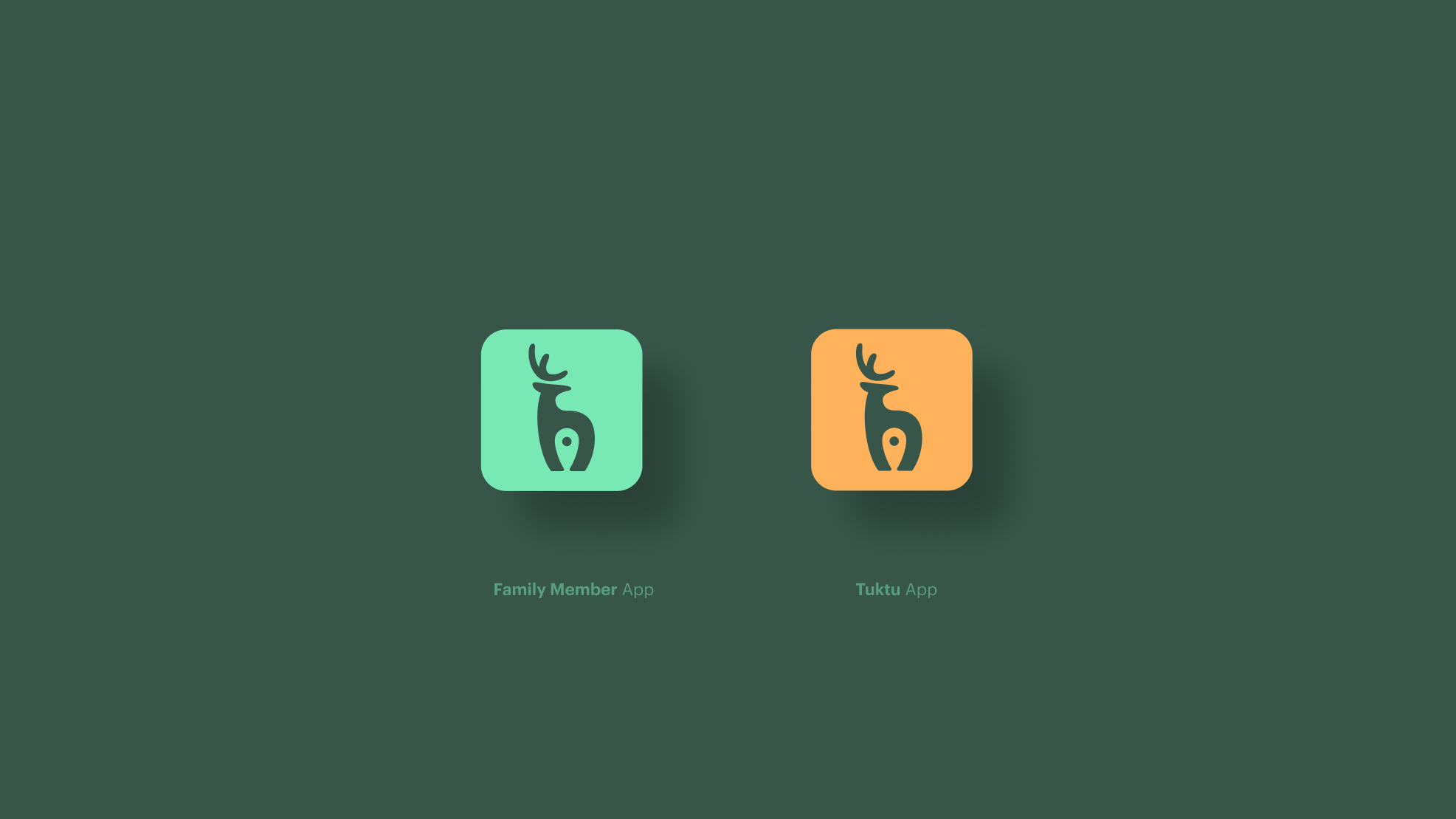
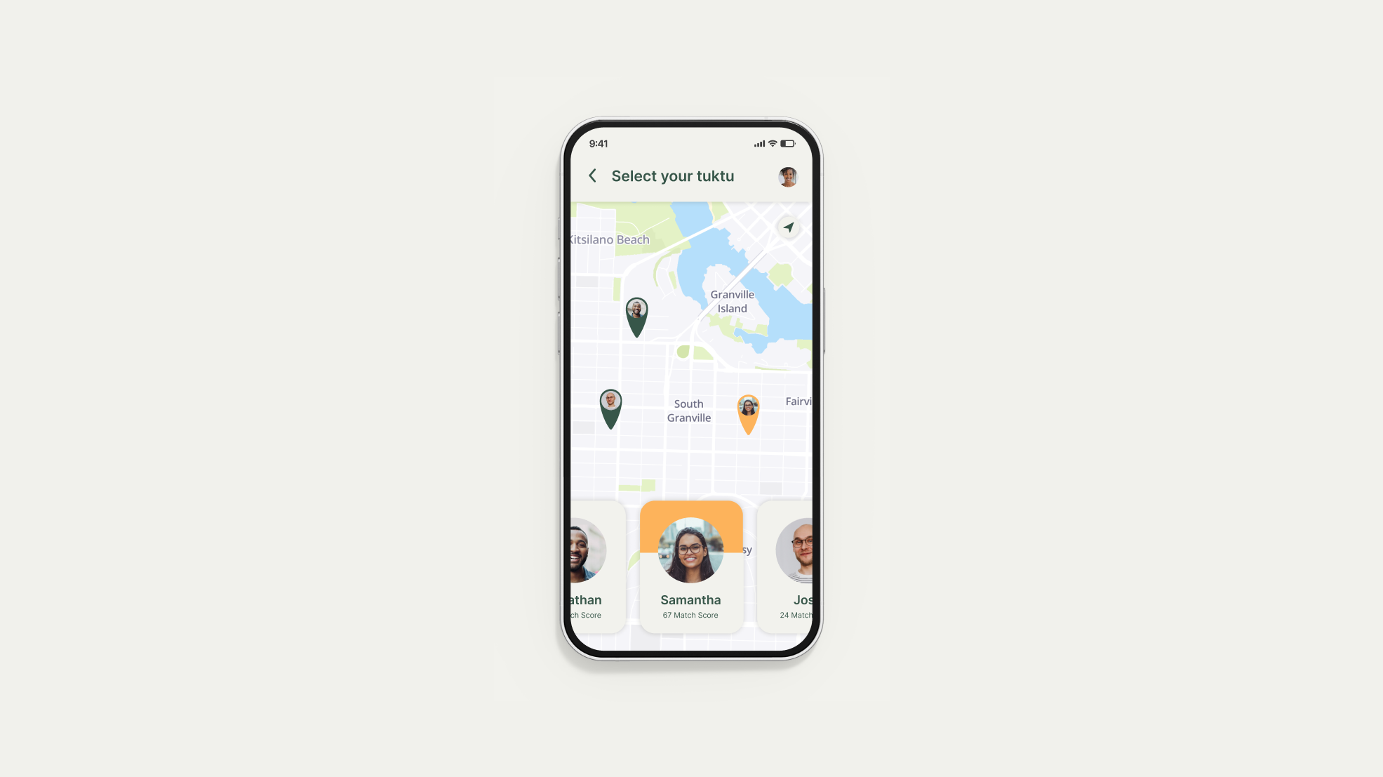
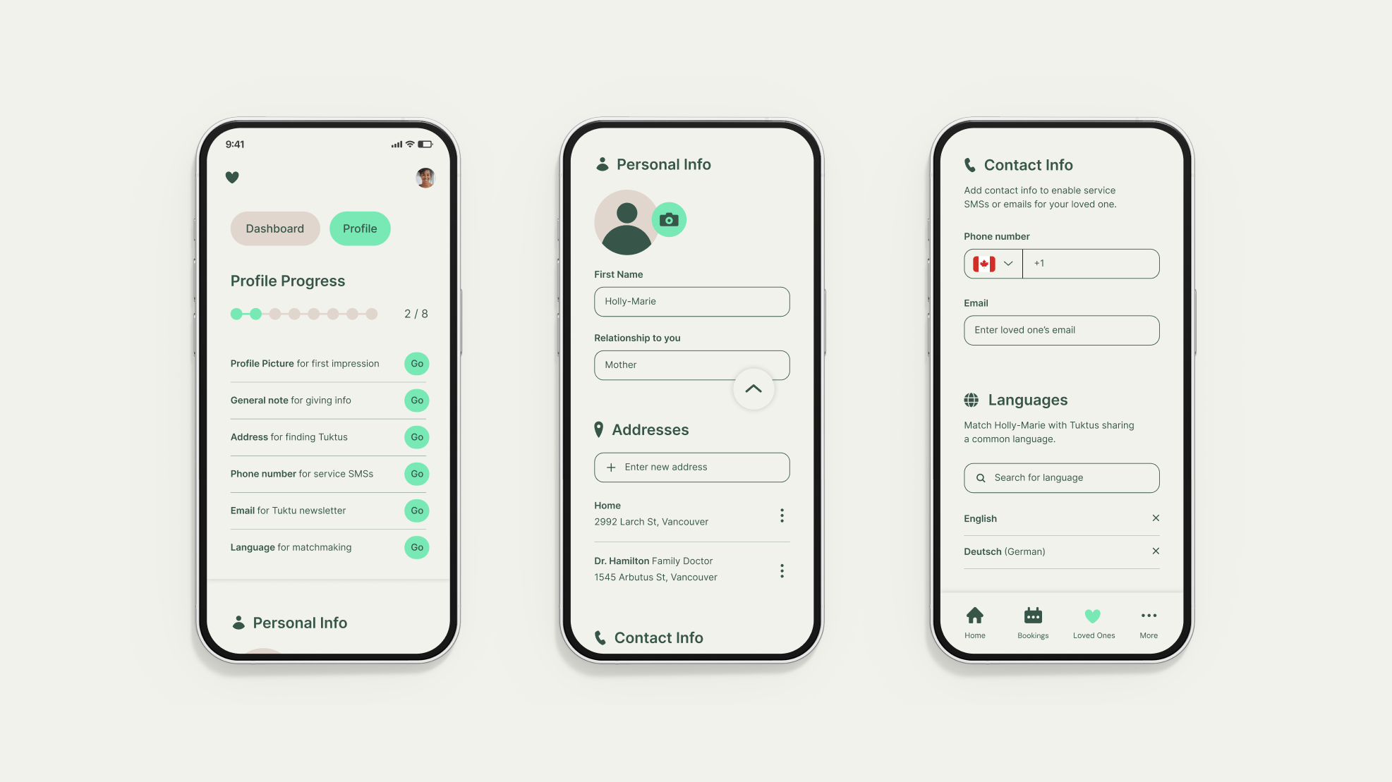
Tuktu is an on demand support service for everyone and anyone who needs a little bit of support. The platform’s smart matchmaking technology matches users with friendly companions from their local neighborhood to help with anything from fetching the groceries, to housekeeping, to help with tech. Their upcoming expansion from Canada into the US market meant their visual identity needed to grow along with them without losing touch with its Canadian heritage. We worked together to redesign the brand and develop a visual UI system for their apps.
The Solution
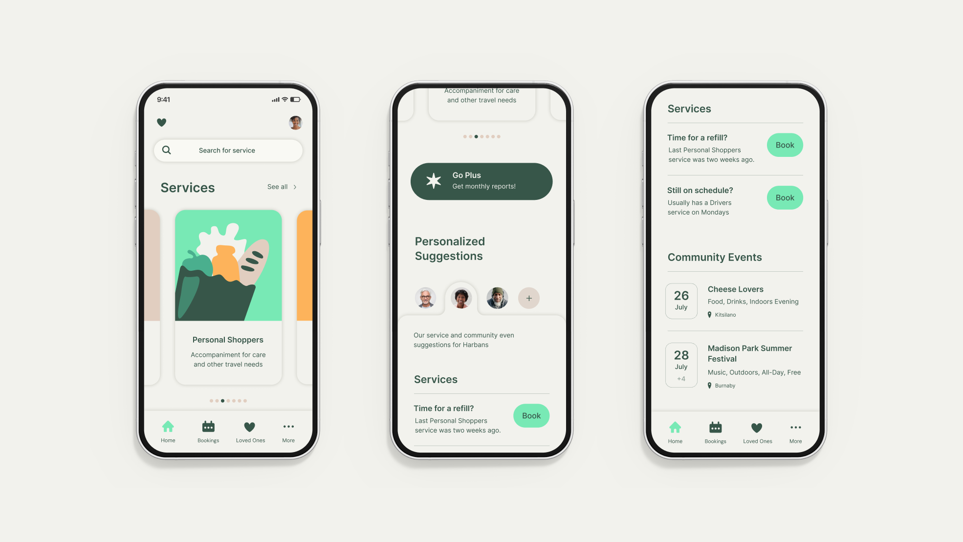
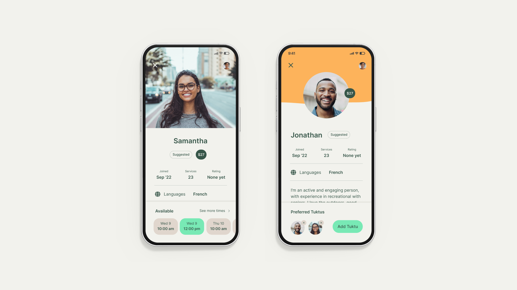
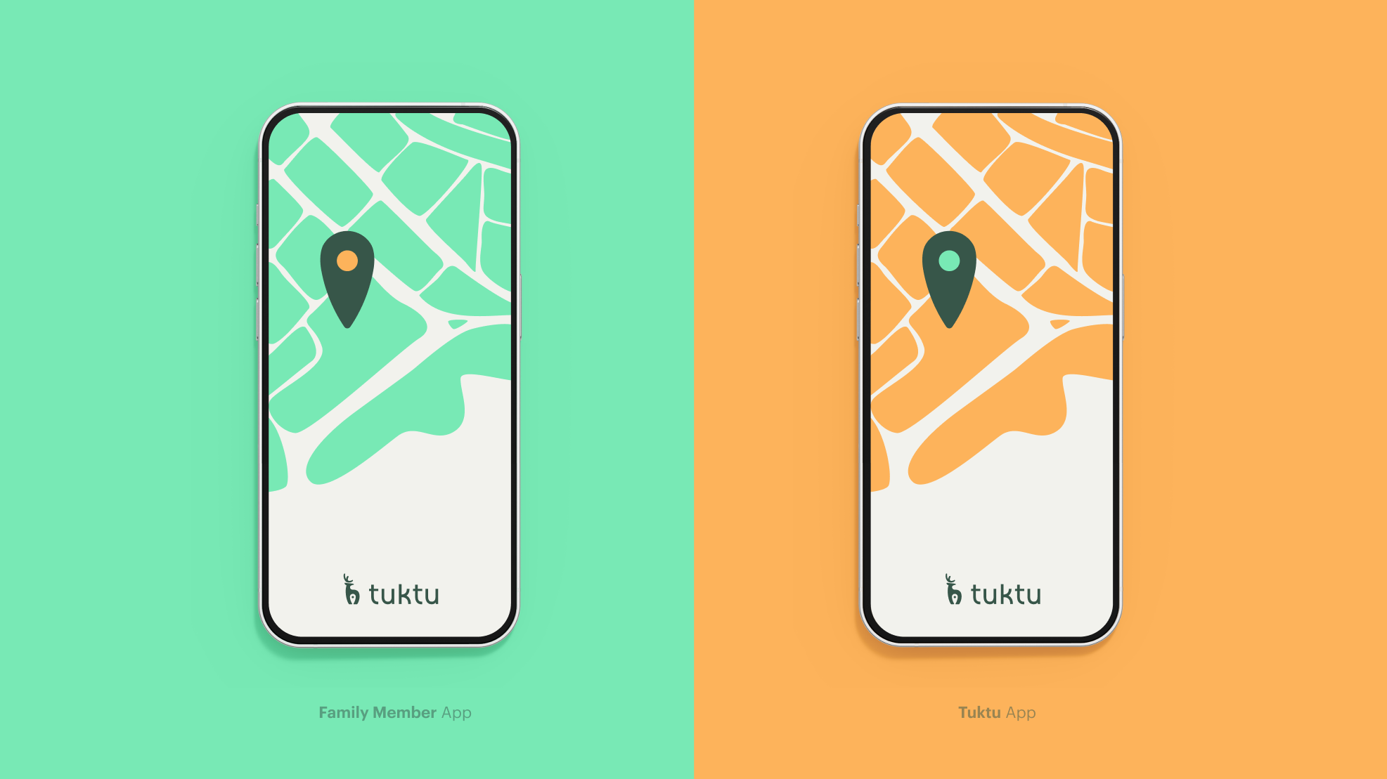
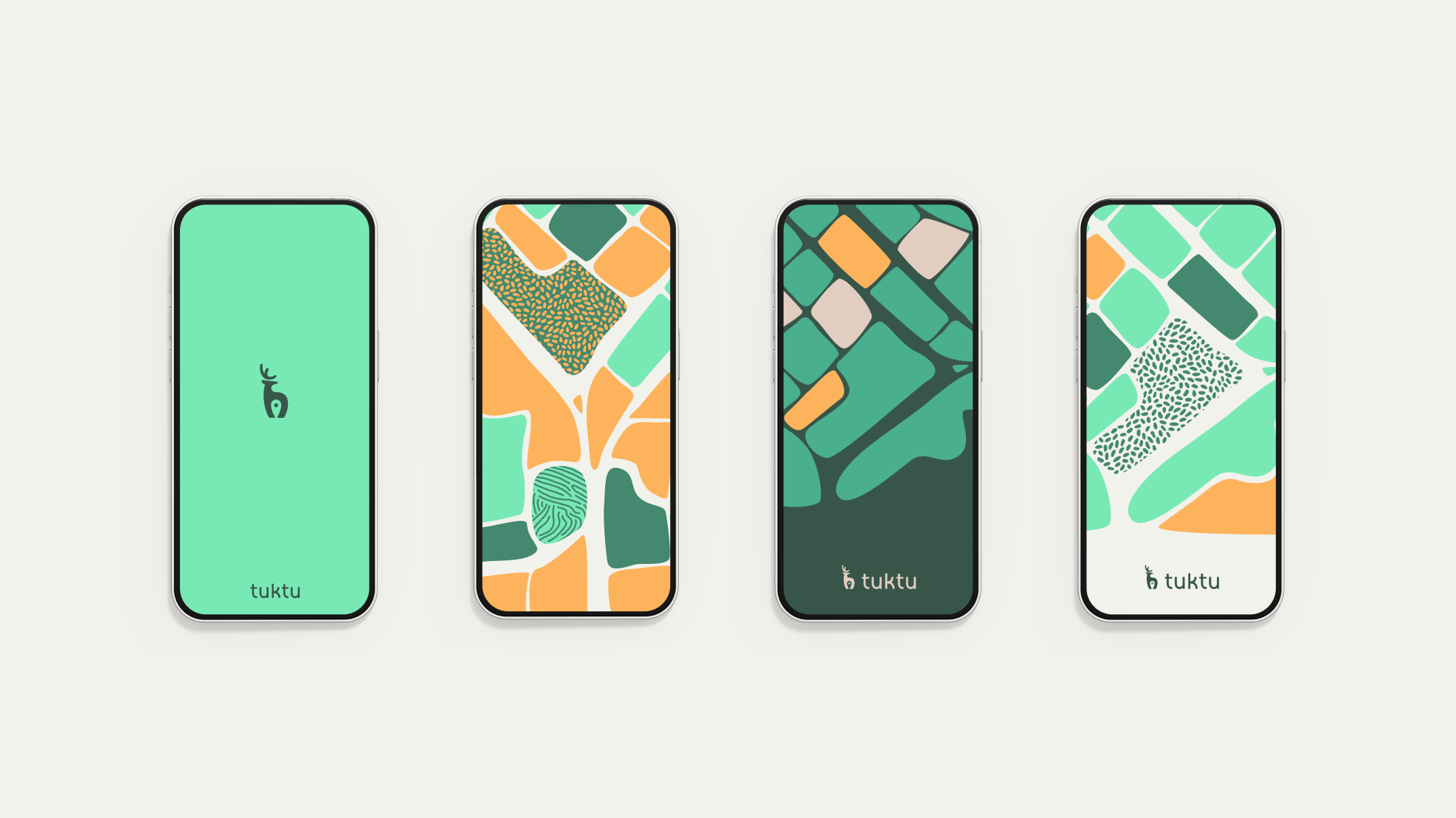
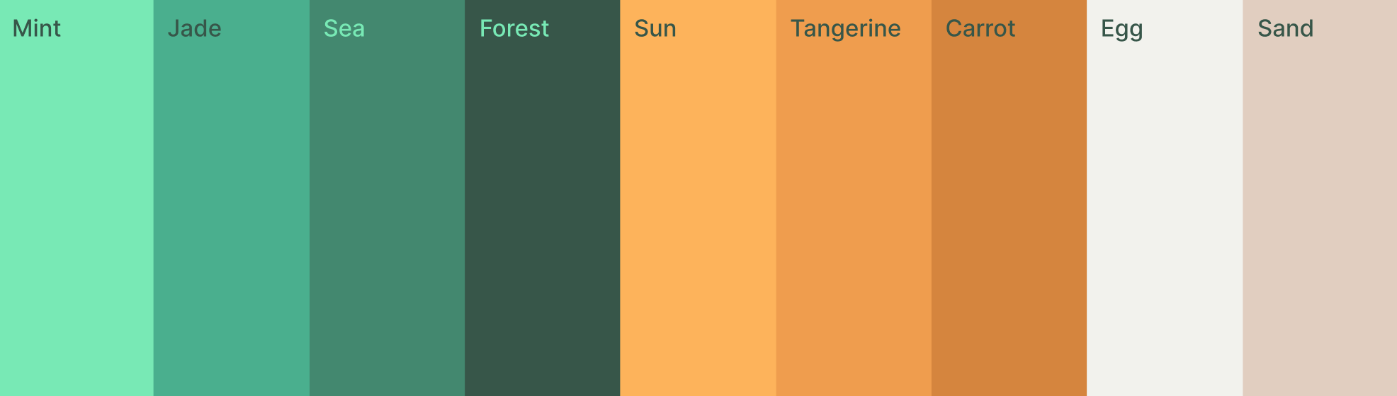
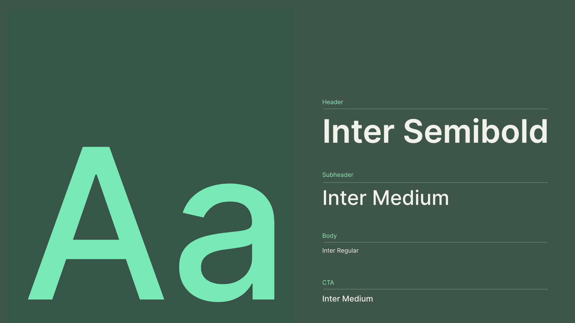
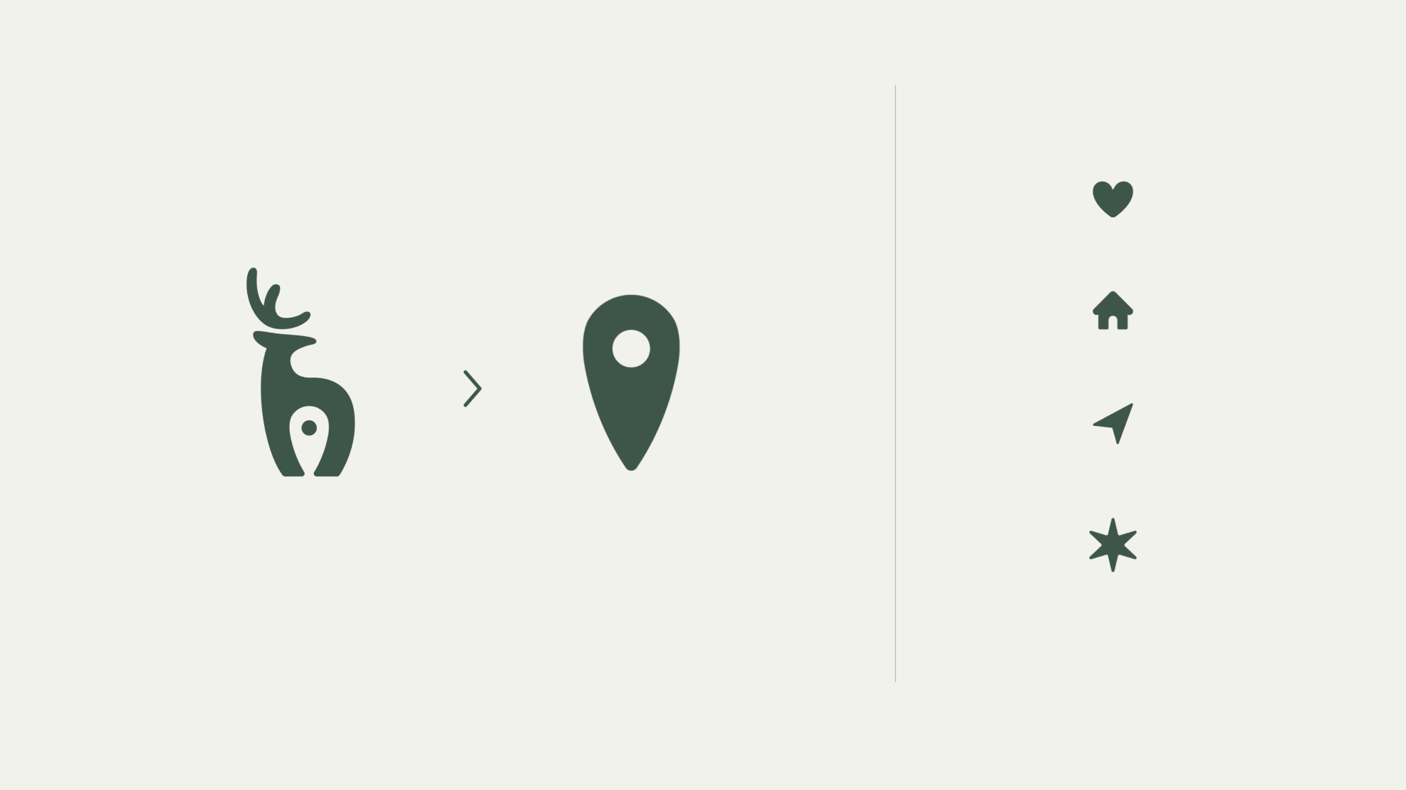
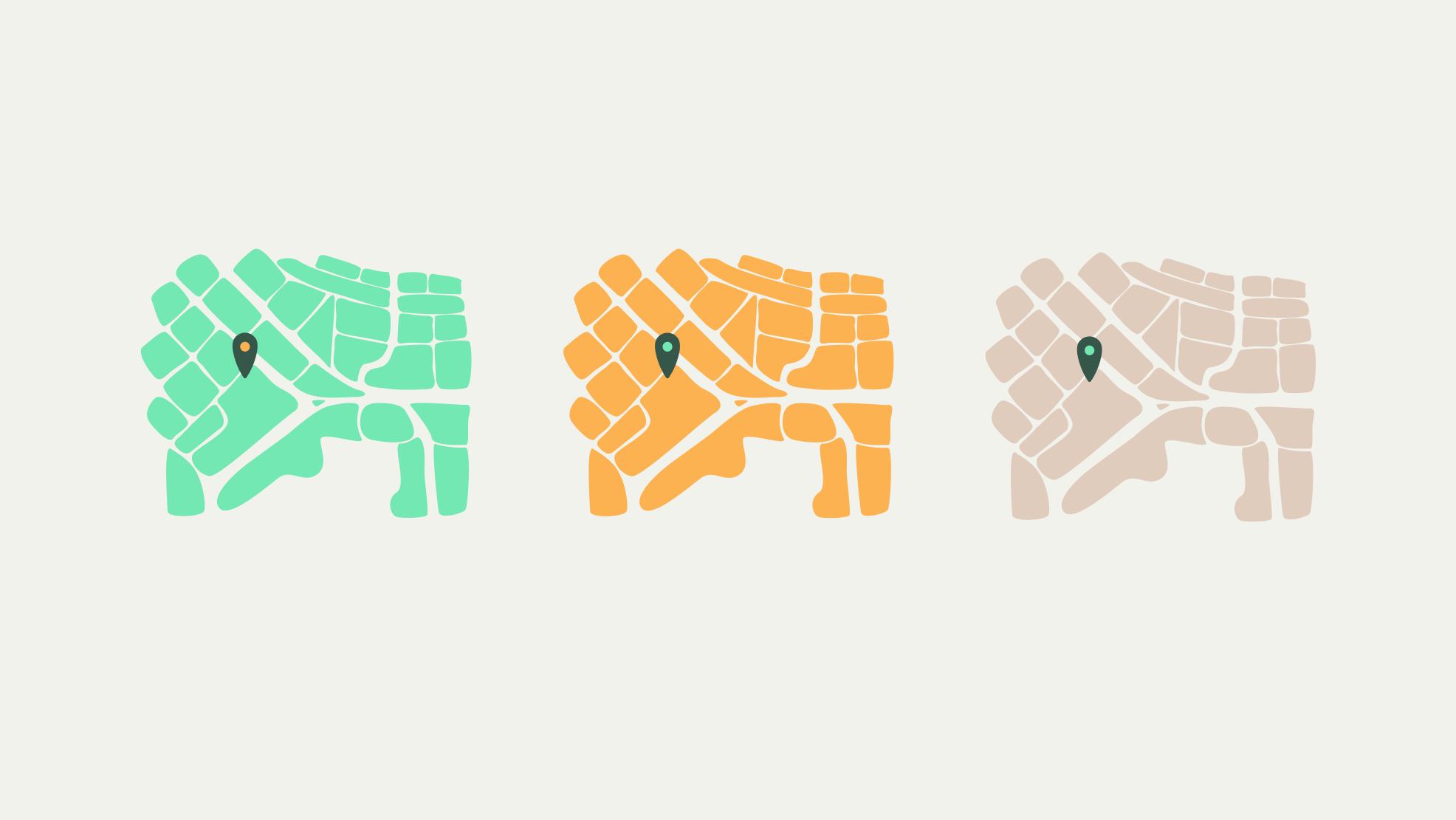
A complete rebrand for Tuktu—including a brandmark that combines their original Canadian caribou mascot with a nod at their offering in the form of a hidden map location tag. I created a color palette that divides up into two sub-palettes, one for their user app and one for their Tuktu/helper app. Once the visual identity was developed, I designed a complete style guide with samples for their app visual UI system.
My Role
I partnered with Tuktu as an individual designer—leading all project planning and client relations. All brand identity and visual UI concept development and execution were done by myself, and I partnered with Tuktu’s lead developer on handing over our app style guide and kicking off the build process.