Redefining the role of iconography for a sleep health brand.
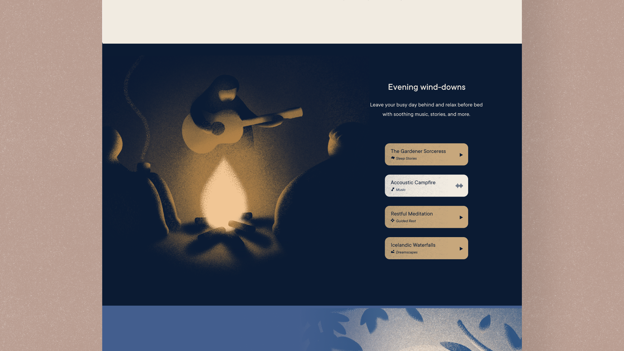
Hatch, an industry leader in sleep health tech, approached me with the exciting challenge of developing a new iconography system for them. They were in the process of redesigning their brand from end to end, and iconography was a key component that needed reimagining, as it plays an important visual role in their app experience and marketing content.
The Solution
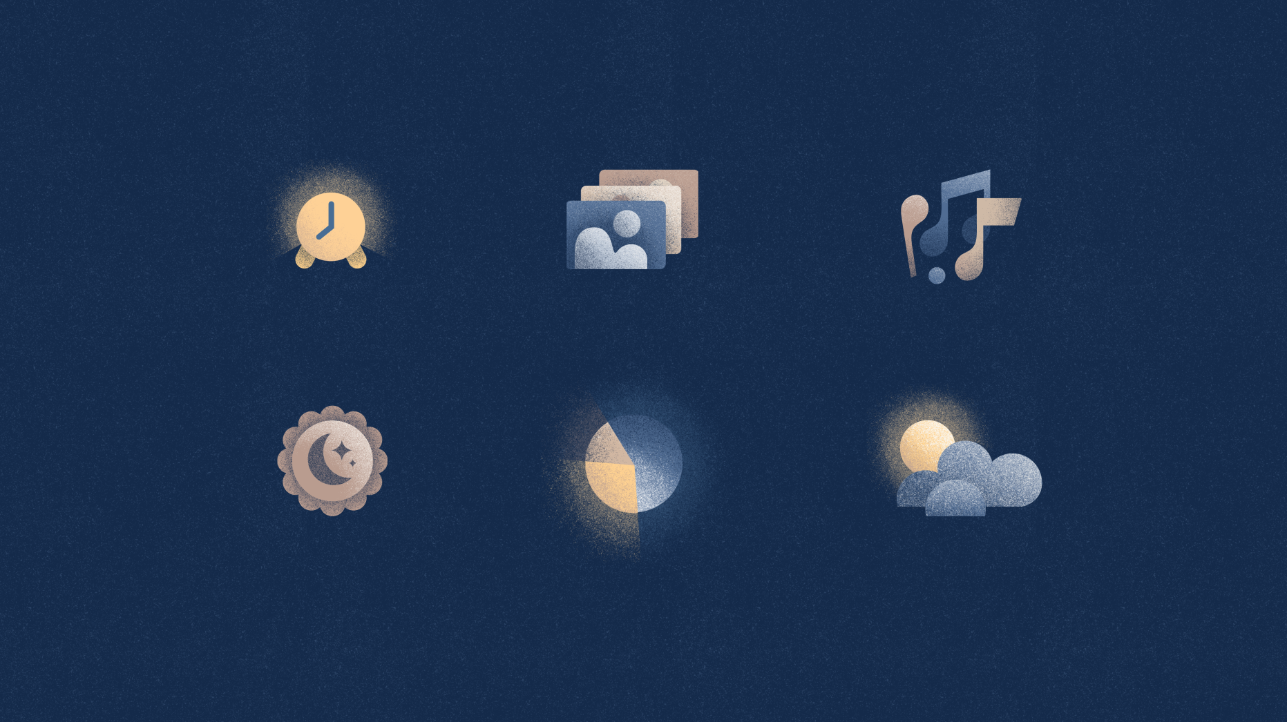
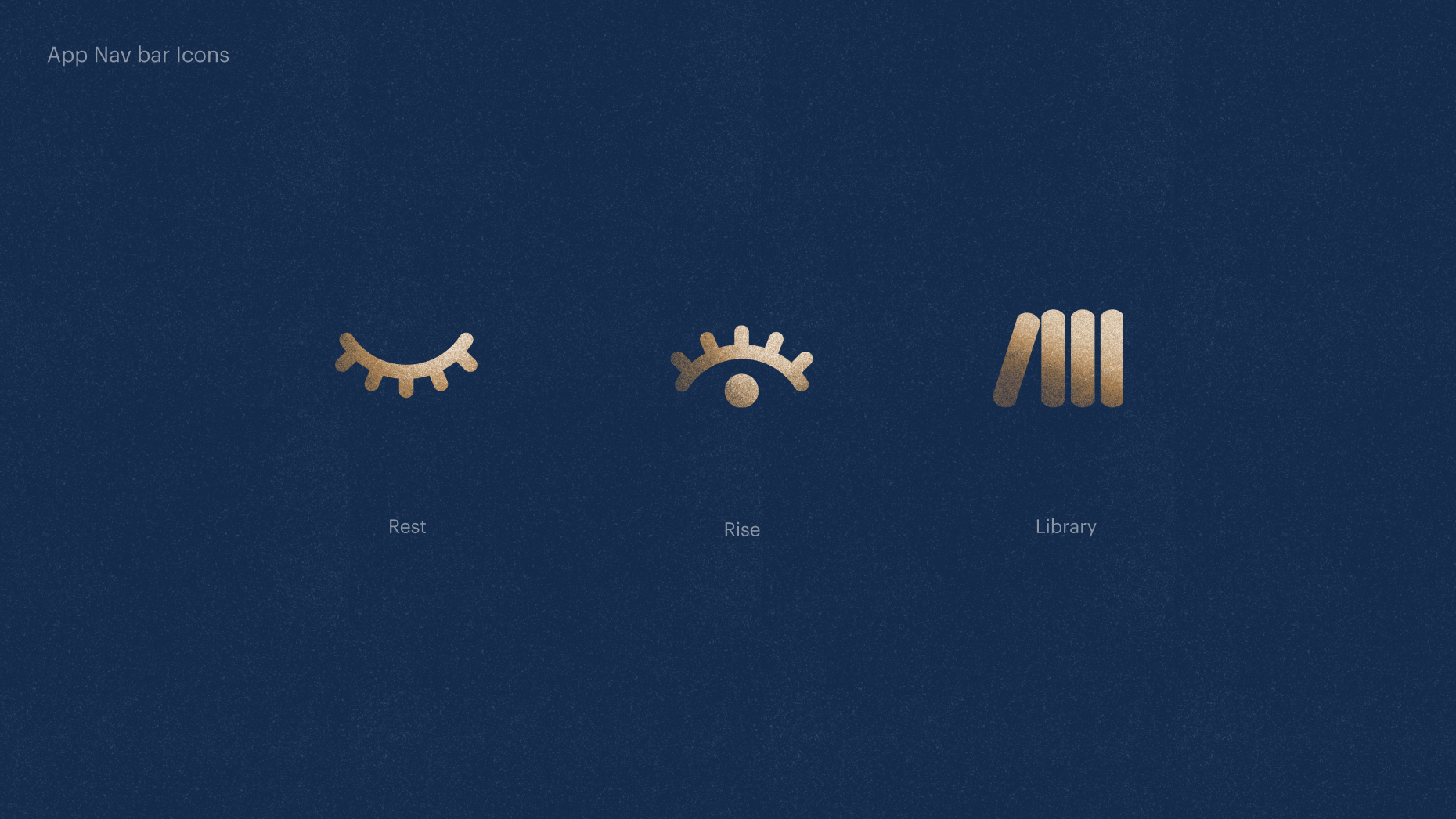
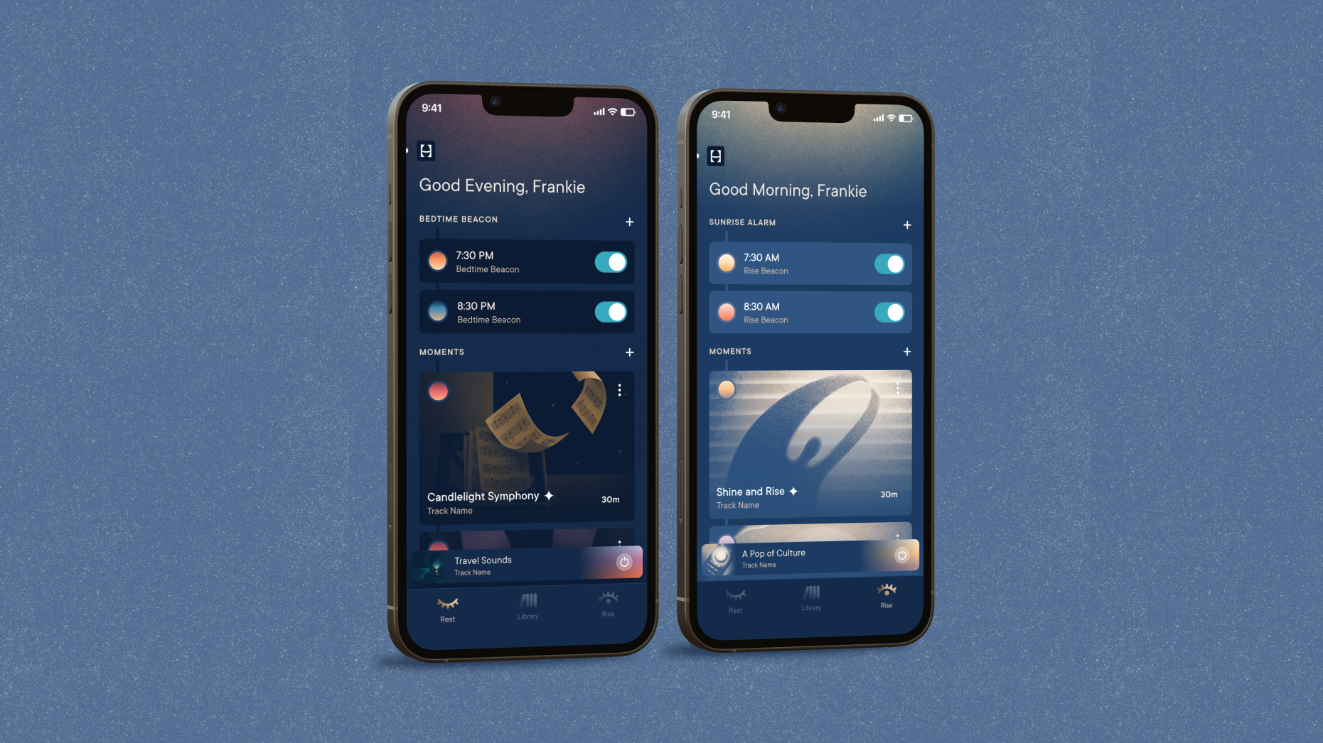
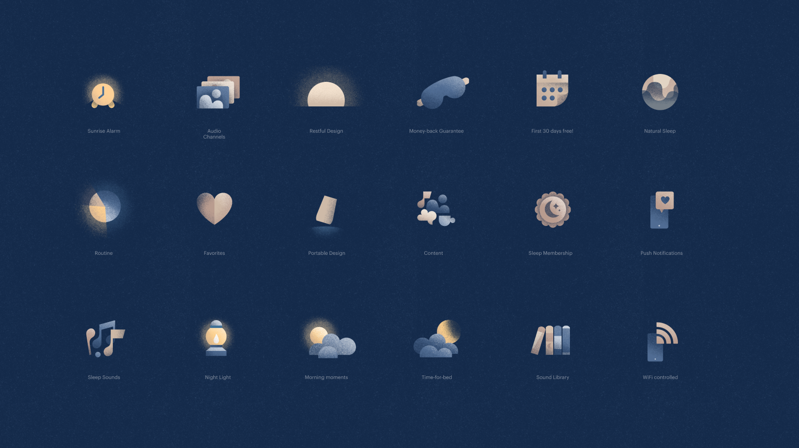
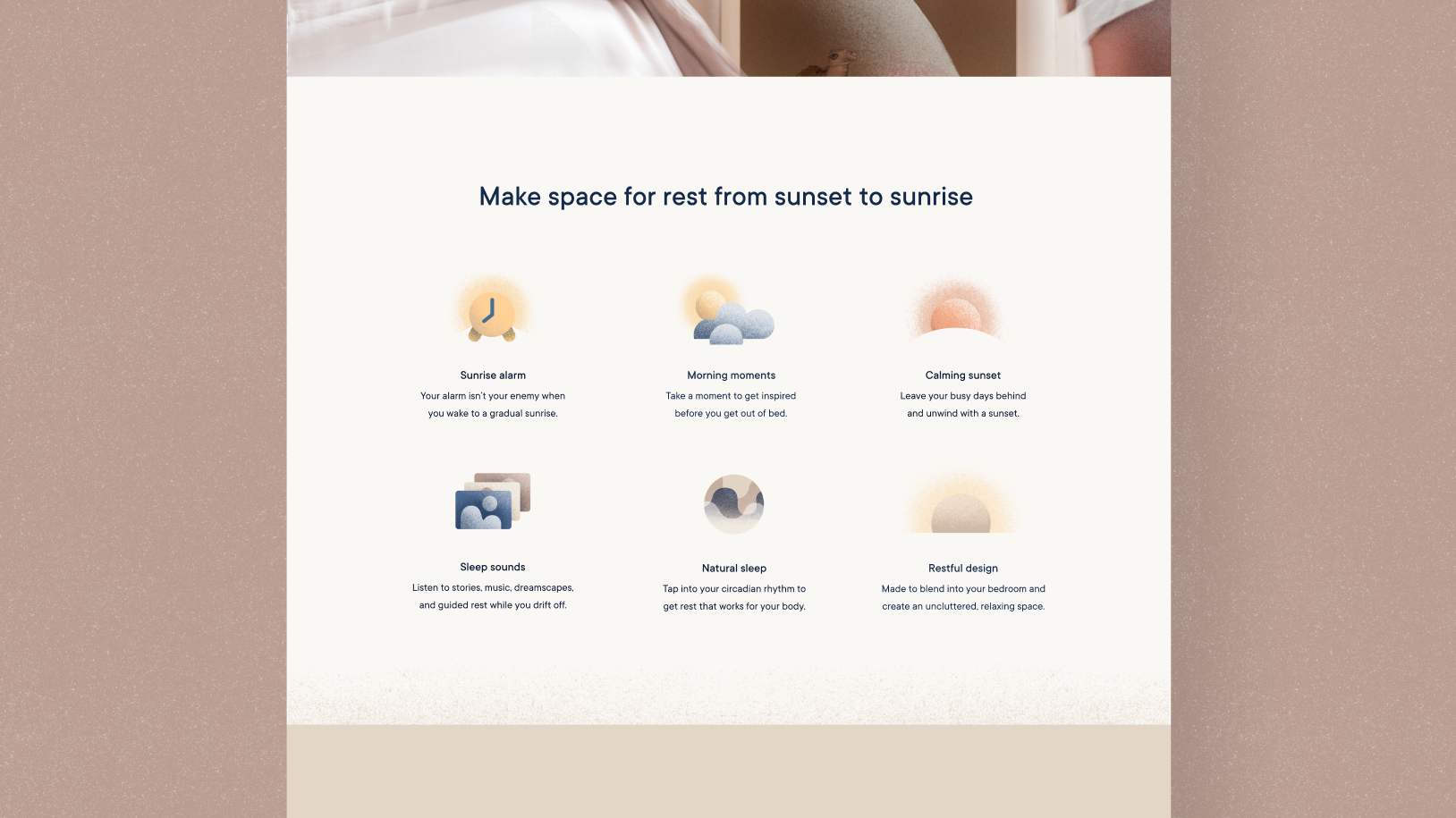
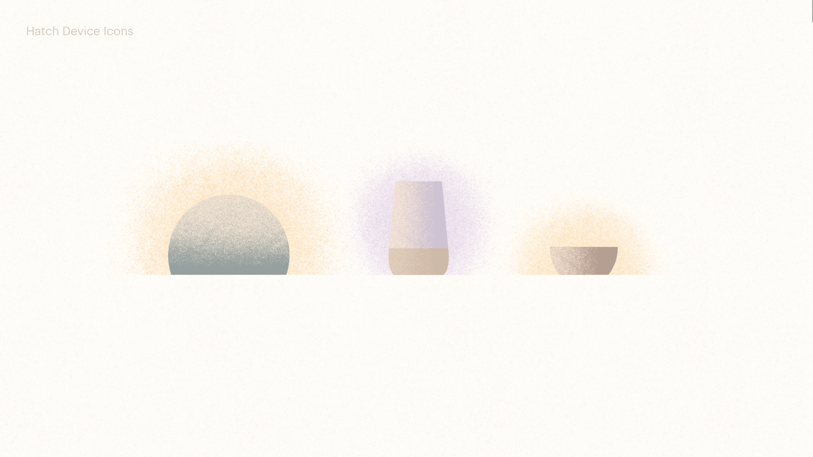
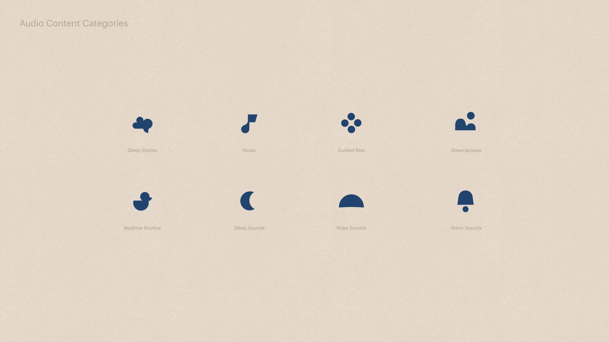
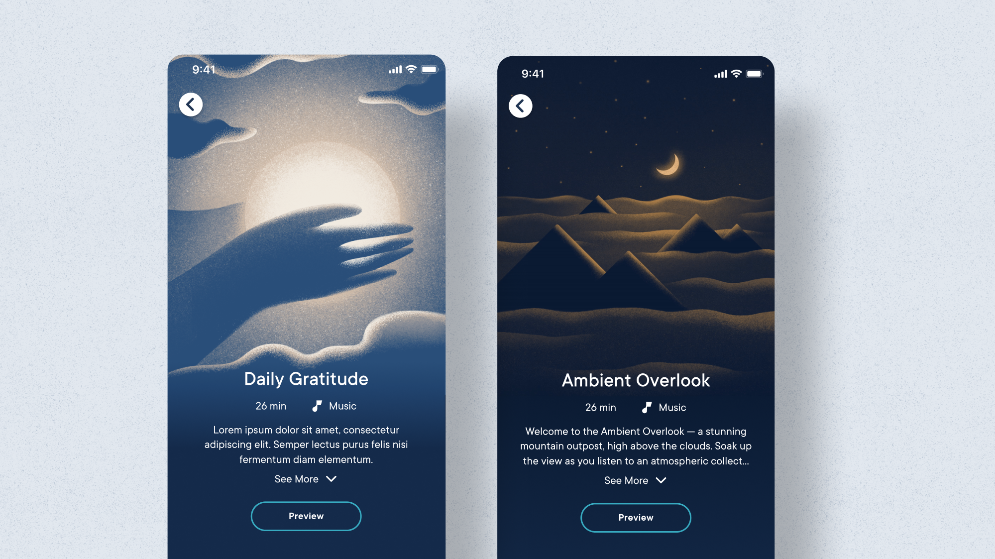
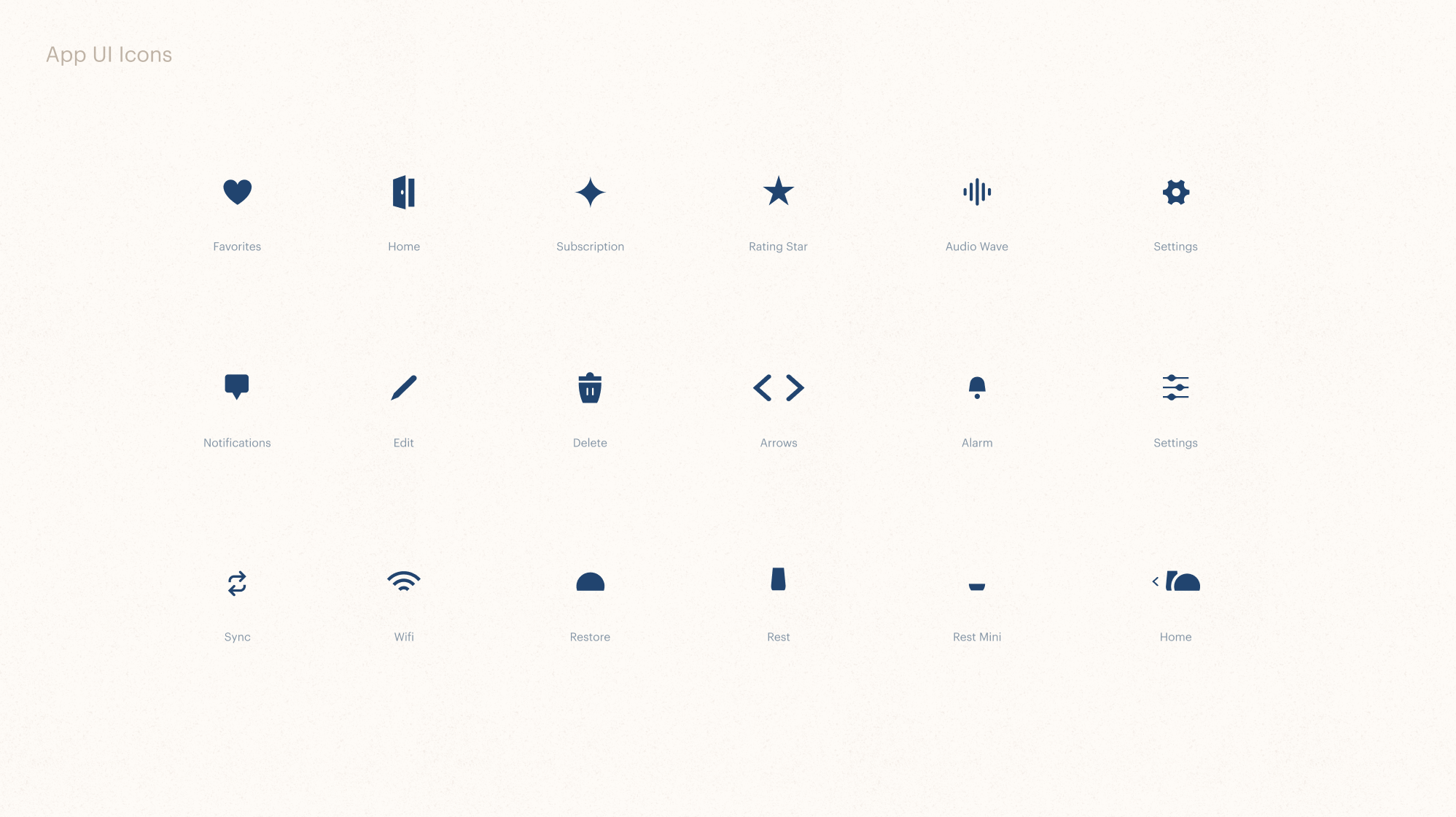
I developed a robust new iconography system consisting of two visual styles—one illustrative style for use in marketing and creative content design, and a simple glyph style for practical use in UI. The entire icon shape system was built upon the brand’s foundational shape language, while the illustrative style was inspired by illumination and the glow of their devices.
My Role
I partnered with the Hatch creative team on this work, as part of a larger ongoing rebrand effort. I lead concept development, sketching, and final design execution of the full icon library, and lead the implementation effort across all creative and digital applications.